I looked and looked and didn’t find anything this specific. I needed a way to only use css to achieve this centering of a menu (not main menu) using the the Divi builder full width menu module.
The Setup
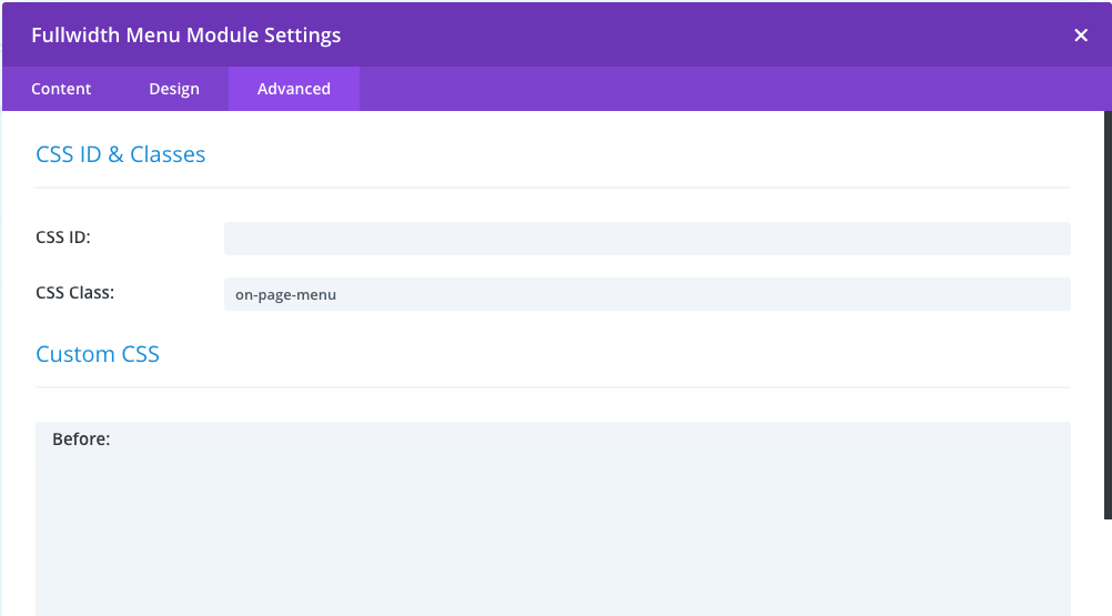
First you need to add a class to the menu so that we can just add these changes to this class so we leave other menus on the site alone. I used .on-page-menu for my class.

The CSS
You can add these styles to Appearance > Theme Editor > Additional CSS , the Divi Theme Options > Custom CSS or a child themes style.css.
The .et_pb_row width is the width of the title. If your title is longer than my “Select Category” than make this wider so that the title sits centered. The title will wrap if it’s too small and may be off center if it’s too long. The .mobile_menu_bar::before styles will override the hamburger icon, you will need to use !important for the font-family to override the fonts they use to produce the hamburger button. Finally, the width in .et_mibile_menu will set the width of the dropdown. you have to use .left as half of the width to ensure the dropdown is centered. Use top to set the distance from the title.
.on-page-menu .et_pb_row {
   position: absolute;
   margin-left: auto;
   margin-right: auto;
   left: 0;
   right: 0;
   width: 150px;
}

.on-page-menu .mobile_menu_bar::before {
   font-family: Lato!important;
   content: " SELECT CATEGORY \25BC";
   font-size: 14px;
}

.on-page-menu .et_mobile_menu {
   width: 300px;
   left: -75px;
   top: 60px;
}
Conclusion

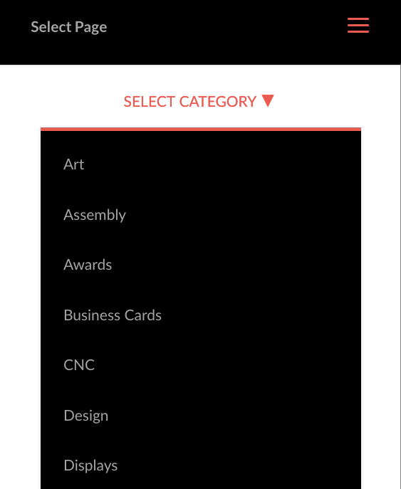
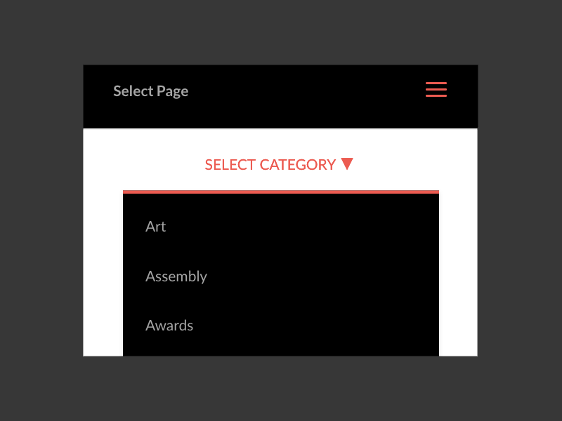
All that is left is setting up the module to use your menu. You should have something like this when you have added the styles and class to the Divi Full Width Menu module. I have changed a few styles within the Design tab of the module such as padding, margins, background color and font color so take that into consideration when comparing.


